

Kristian Axelsson
Data Scientist
@ Sensative
By combining multiple data sets from different sources you can learn a lot, even if the data sets themselves are quite small. This is something to consider when you plan installing IoT sensors.
In the following example from one of Sensative’s school projects we combine five different sources to gain some insights in how this classroom should be used. This would be difficult to understand if using, for instance, just a temperature sensor.
If you want you can skip the analysis and go directly to the conclusions.
Sensor setup
This example covers one week of data from a class room with 23 pupils. The data set contains data from three different sources, listed below.
The sensor solution located at each desk provide the following measurements.
- Relative Humidity: Units: %
- Temperature: Units: Celsius
- Light: Units: Lux
- Motion: Units: Number of motion counts
- Occupancy: Units: 0 = Unoccupied 1 = Pending (Entering or leaving) 2 = Occupied
The CO2 sensor solution.
- Relative Humidity: Units: %
- Temperature: Units: Celsius
- Light: Units: Lux
- Motion: Units: Number of motion counts
- CO2: Units: ppm
The sound sensor solution.
- Relative Humidity: Units: %
- Temperature: Units: Celsius
- Light: Units: Lux
- Motion: Units: Number of motion counts
- Sound: Units: dB


The green circles with smiling faces located by the desks are the desk sensors. The green circle with CO2 is the CO2 sensor and the last green circle with an ear is the audio sensor. The CO2 sensor and the audio sensor is located by the blackboard of the class room.
Temperature & humidity and CO2
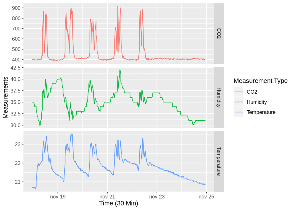

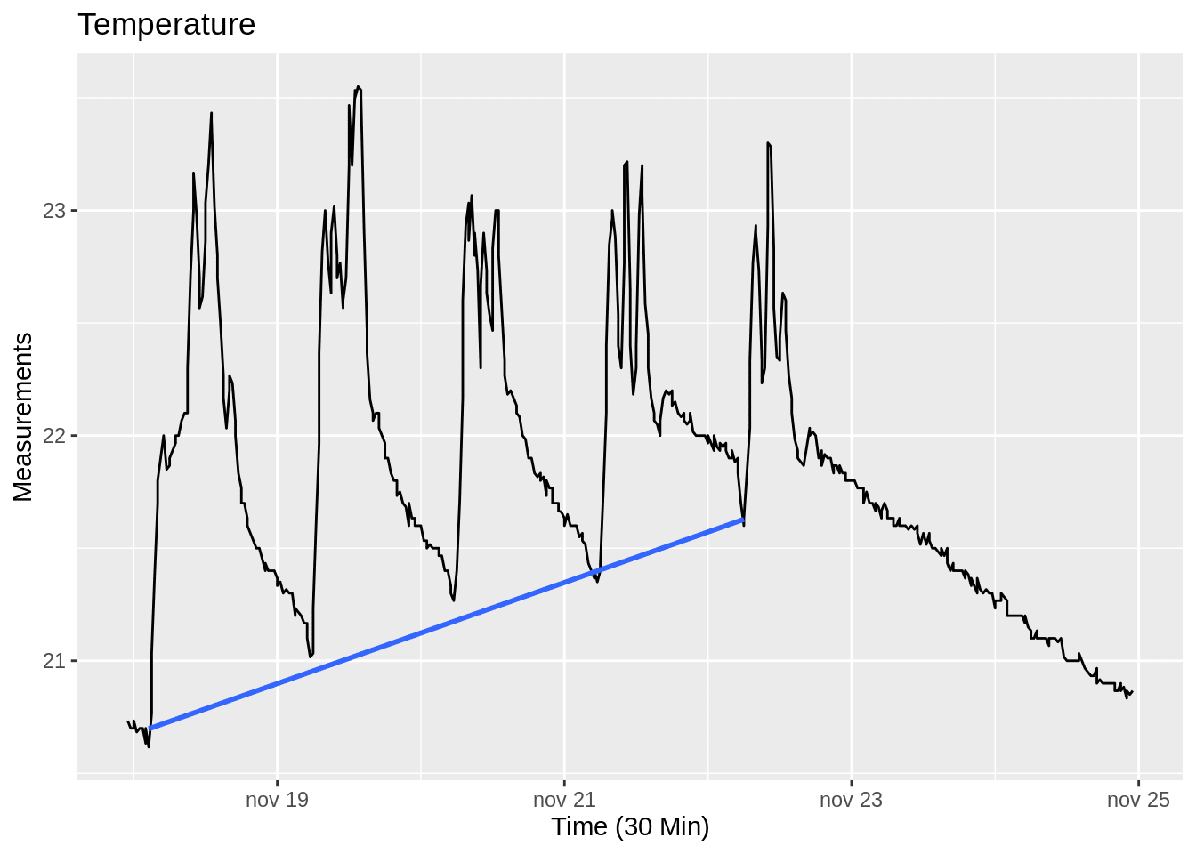
The first thing that stands out when looking at the plot above is the regular pattern of each weekday. The build up of temperature and humidity during the week defines the second pattern. The build up of temperature and humidity is characterised by accumulating daily lows. At the end of each weekday the temperature and humidity are unable to go back to normal. During the weekend on the other hand the temperature and humidity have enough time to go back to normal. The following plots depicts the build up pattern.

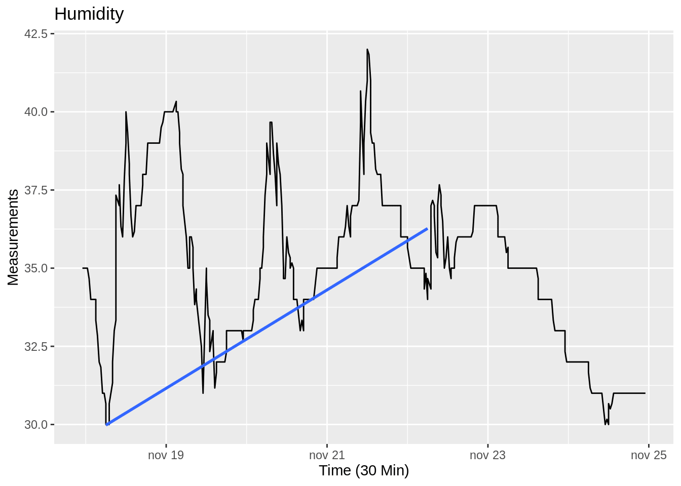

The plot above depicts the humidity during the week and the trend line (blue line) shows that humidity is accumulating over time. The humidity builds up with an average rate of 1 percentage point per day.
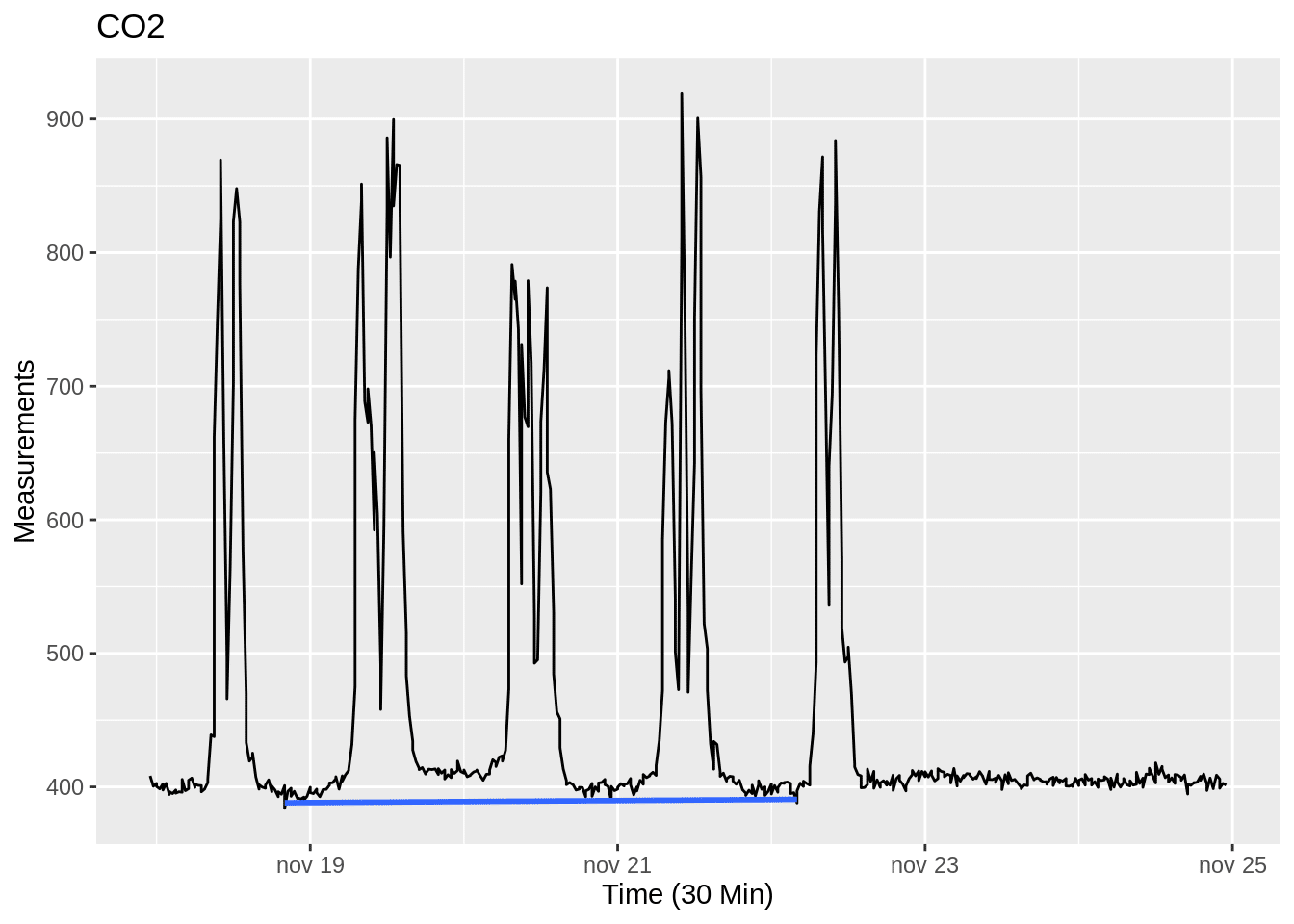

Lets explore the correlations between temperature, humidity and CO2. One reason for that is to see if there is any indication, that might help explain similar patterns shown in the previous plots. The previous plots indicates that the build up might be due to movement or the presence of humans. In that case there would be a strong correlation between the CO2 and temperature.
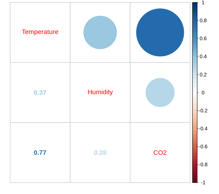

As we suspected, the plot above show a strong correlation between temperature and CO2. Which support our thesis above, hence further indicating that the temperature and CO2 is mainly built up by motion and human presence.
Add motion data
Lets look at temperature and CO2 in relation to motion.
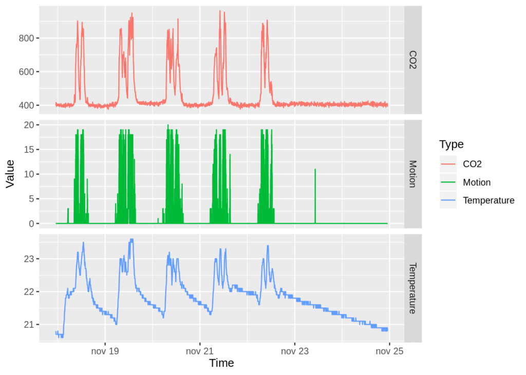

The plot above depicts a similar shape for all the variables, namely CO2 , temperature and motion. The plot also depicts that the higher value of the motion, the higher the value of both temperature and CO2 as well. The plot gives further support to our thesis that human presence and motion drives the temperature and CO2 . In order to be more certain on our claim, lets look at the correlation between temperature, CO2 and motion.
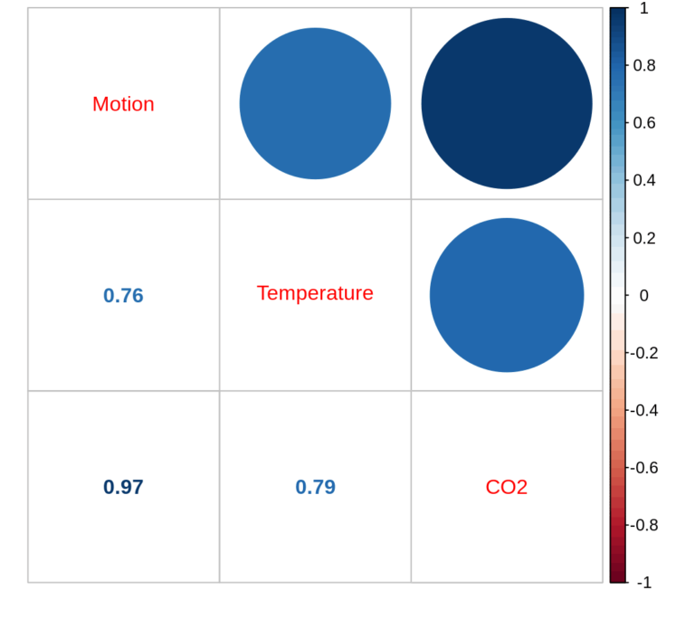

The correlation between temperature, CO2 and motion are very strong. A correlations coefficient of 0.97 between motion and CO2 is very high. Hence indicating that a majority of the CO2 build up can be explained by the motion. The correlations coefficient of motion and temperature is 0.76. Hence conveying that the more motion the higher the temperature in the class room. Another thesis arise from the strong correlation between CO2 and motion namely that increased motion and CO2 is an indicator for high sound levels.
Lastly, add sound data


The plot above depicts CO2 , temperature and motion as in the previous chart as well as dB average and dB peak. Moreover, the plot shows that all the variables expresses a similar pattern. Hence giving further support to our thesis that there is a relationship between the sound level and motion. Lets see if the correlations verifies our thesis.


The plot above shows that there is a strong correlation between all the variables. The correlation coefficient for motion and average sound level (dB Average) is 0.93. Whereas the correlation coefficient for motion and dB Peak is 0.78, which is lower but still strong. Additionally, the correlation coefficient for CO2 and average sound level is also at 0.93. Hence supporting our thesis that CO2 level is induced through exhalation. Lets explore the relationship between the sound levels and motion further.
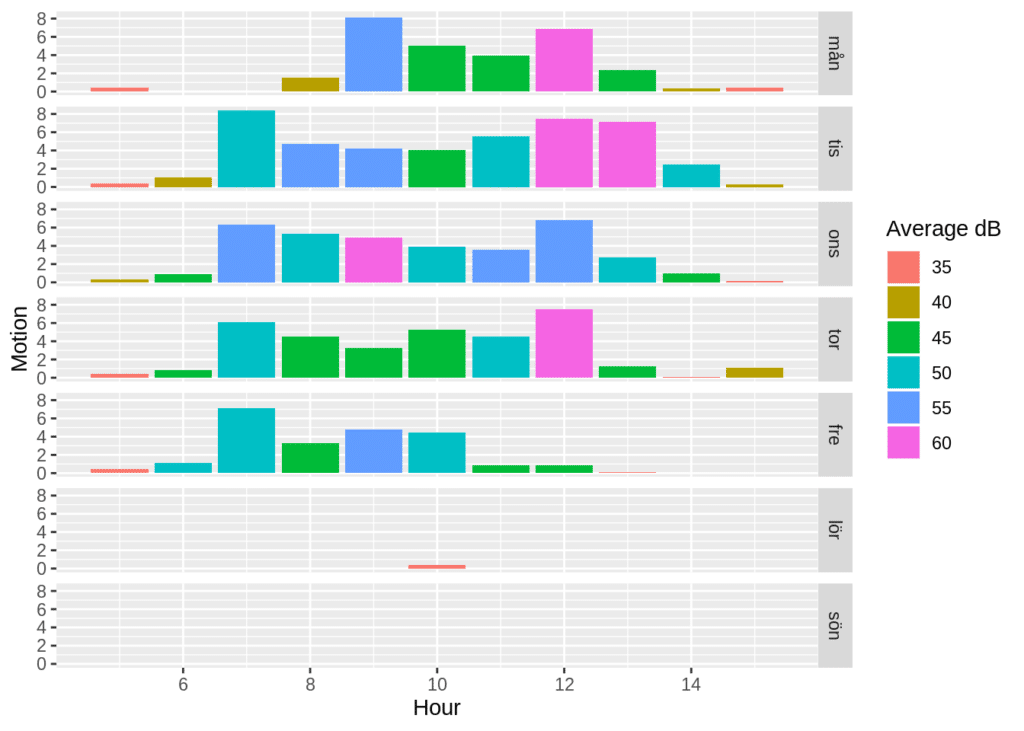

The plot above depicts the hours between 5 and 16 on the x axis and the motion on the y axis as well as colour of the bars displays the average sound level as the. The value in dB tend to be abstract and hard to comprehend, hence the short list of comparisons below:
- 55 dB Household refrigerator
- 60-70 dB Normal conversation
- 85 dB City Traffic
Source: https://ehs.yale.edu/sites/default/files/files/decibel-level-chart.pdf
As seen in the list above and the plot above the average sound level is where it is suppose to be. Lets explore if the peak sound level is as tolerable.


The plot above shows the hours from 5 to 16 on the x axis, the number of individuals present at their desks on the y axis and the peak sound level assigns the colour of the bars. The peak sound levels displayed above are rather high, lets compare them with the list below:
- 85 dB City Traffic
- 95 Subwy Train at 60 meters
- 110 Chain Saw at 1 meter
Source: https://ehs.yale.edu/sites/default/files/files/decibel-level-chart.pdf
Additionally, sustained sound levels of 80-90 dB might result in hearing loss. The measurements are thus important in order to maintain good working conditions.
This plot seem to give support to our thesis that the sound level increases as the number of individuals increases as well as before the number of individuals decreases. This is probably when a lot of chairs and desks are moved. Finally, lets confirm the support for our pattern through plotting the correlation.
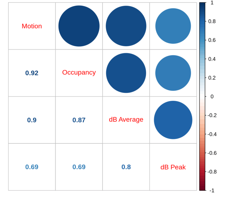

As seen in the plot above there are strong correlations between all of the variables. The correlation coefficient for motion and occupancy is 0.92. The correlation coefficient for occupancy and the average sound level (dB Average) is 0.87. Whereas the correlation coefficient for motion and average sound level is 0.9. Hence, implying that the more occupants in the room, the more motion there is and the higher the average sound level. The correlation coefficient for the peak sound level (dB peak) and occupancy is 0.69, which is the same as for motion and peak sound level. Once more it confirms the relationship between more individuals, more motion and higher peak sound levels.
Conclusions
- The temperature and humidity of the class room builds up during the week.
- The class room needs the weekend to be unoccupied in order for the temperature and humidity to go back to normal levels.
- The facility can’t currently be used during the weekend without causing more build up, unless some changes are made to the ventilation system.
– Kristian


